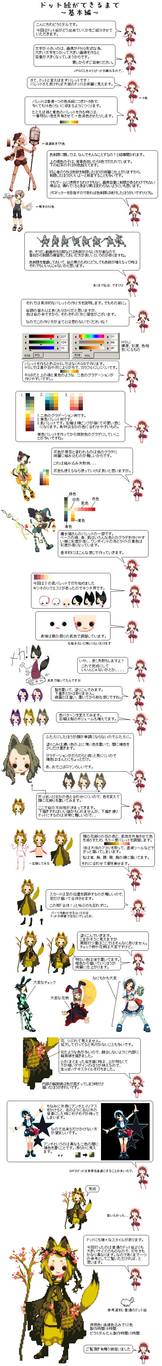
Danbooru
Login Posts Comments Notes Artists Tags Pools Wiki Forum More » Listing Upload Hot Changes Help

Search

Blacklisted (help)

  • guro
  • scat
  • furry -rating:g
Disable all Re-enable all

Artist

  • ? collet 32

Copyright

  • ? original 1.3M

General

  • ? 6+girls 90k
  • ? animal ears 1.3M
  • ? basket 21k
  • ? book 153k
  • ? cage 5.7k
  • ? camisole 50k
  • ? cat ears 314k
  • ? cat tail 174k
  • ? checkered clothes 21k
  • ? checkered legwear 752
  • ? cup 204k
  • ? dark-skinned female 198k
  • ? dark skin 319k
  • ? dress 1.5M
  • ? flower 693k
  • ? fox ears 164k
  • ? fox tail 115k
  • ? hat 1.3M
  • ? head wreath 16k
  • ? how to 1.4k
  • ? lantern 30k
  • ? maid 165k
  • ? maid headdress 161k
  • ? mecha musume 13k
  • ? multiple girls 1.7M
  • ? pixel art 22k
  • ? platform footwear 8.3k
  • ? rabbit ears 252k
  • ? rose 117k
  • ? sandals 113k
  • ? shield 31k
  • ? shorts 501k
  • ? solid circle eyes 9.4k
  • ? staff 64k
  • ? sword 301k
  • ? tail 884k
  • ? teapot 15k
  • ? tray 40k
  • ? twintails 991k
  • ? weapon 655k
  • ? witch hat 109k

Meta

  • ? commentary request 3.6M
  • ? highres 6.0M
  • ? ↳ absurdres 2.1M
  • ? tall image 16k
  • ? translated 582k

Information

  • ID: 1134895
  • Uploader: Tenebrous »
  • Date: about 13 years ago
  • Approver: NWF Renim »
  • Size: 273 KB .png (563x4723) »
  • Source: pixiv.net/artworks/1678796 »
  • Rating: Sensitive
  • Score: 12
  • Favorites: 12
  • Status: Active

Options

  • Resize to window
  • Find similar
  • Download

History

  • Tags
  • Pools
  • Notes
  • Moderation
  • Commentary
original drawn by collet

Artist's commentary

  • Original
  • ドット絵ができるまで~基本編~

    たくさんの閲覧と評価、コメントありがとうございました。

    あくまで私個人の打ち方ですので、本気でドットをやられる方はいろんな人のメイキングをご覧になったほうが良いと強く思います。 ::: 補色と中間色を言い間違えてます ::: 「結局は努力」「結局は才能」などなど、絵について深く考えさせられるタグが付きましたが、最終的にわたくしの情熱タグでふっとばさせていただきました。あしからず。でもこういうことを真剣に考えるのはとてもいい経験になりました。

    • ‹ prev Search: user:Tenebrous next ›
  • Comments
  • Recommended
  • Loading...

    There are no comments.

    I wanted to say it...
    This text is small because this image is in PNG file format, and having bigger text would also make the image larger. I'm sorry about that.
    How to Make Pixel Art ~The Basics~
    Many people ask why you would use color restrictions. The brown girl on top has 5 colors besides the background color. The girl with the tea has over 50 colors. It's common advice for beginners that color restrictions will make your pixel art look better, so you should use them. But unless your pixel art is going to be used in a game or you have limited screen size, I don't think matters that much when you're more experienced. But if you want to be a pro pixel artist, you should definitely use color restrictions.
    JPG messes up pixel art...
    Hello, my name is Piramidaru. Today, I'd like to show you how pixel art is made.
    Now then, pixel art starts from the palette! Most pixel art will look nice as long as you have a good palette!
    ←8 colors
    Let me go into the specifics on how to make a palette. But before that. I'm sure you artists know this already, but the soul of a picture is its colors, so everyone does it differently. So remember that this the only way, ok?
    Usually, a palette will have 3-5 colors in each color ramp, and about 16 colors at most. For example, if you were making a palette with green and golds, you could use one less color by having your golds and greens share the brightest color.
    Oh, right. It's much easier to make animations when you use less colors, so it's good to have practice restricting your colors. If you're using color restrictions but absolutely need more colors, I don't think there's anything wrong with adding more colors.
    But that's just my opinion.
    HSL: You can adjust hue, saturation, and lumiosity.
    Use RBG instead of HSL to make your palettes. With HSL, it tends towards black, white, and gray, so it's hard to make it colorful. With RBG, it's easy to make gradients with two colors, like green and gold here.
    1. Examples of two-color gradients. 2. Examples of monochromatic palettes. 3. Palettes for skin. The left palette has a bright pink, so it gives a cute feel. The middle is easy to use with other colors. A lot of the time, you can start with a monochromatic palette, then turn it into a two-color gradient.
    People say grays are taboo because it's hard to make them work well with other colors. Here's an example where the grays aren't compatible... But if you can use grays, then go ahead.
    Part of the palette for this witch cat. The base colors of green, blue, and flesh-tone have low saturation so they can be in multiple gradients, while the accent colors of red and bright yellow have high saturation. That's how I usually make palettes.
    I was being serious here.
    Here I started with this palette. I got a request for a fox, so these are fox ears.
    I adjusted her face using the surrounding skin colors.
    Like makeup, it's scary how mow much that can transform.
    I still mess up a lot, you know? Sometimes I call it done here...
    MECHA!
    I tried painting the hair in. I didn't use a sketch. I didn't start from lines, and just painted it and chipped at it.
    I tried different color schemes. The right one has more hair too.
    I adjusted the palette so that the flower garland and skin could share colors. I used the straight line tool to sketch out her body. I drew them, going in the order neck, chest, waist, shoulder, and arms. Then I added clothes on top.
    It's hard to adjust the leg placement underneath the dress, so I'll draw them separately and fuse them later. Don't forget to shout "Fusion!"
    ←5 colors excluding transparancy.
    ←A shocking 52 colors.
    It's harder to make grayish colors work with other colors, so I adjusted the colors and added a garland on her head. This is when I decided on the direction to go with. Maybe I should have done a rough draft, but it's really hard to to follow a rough draft...
    Let's paint it in. It looks detailed, but it's actually not that much work. But checkered and flowery patterns are more complicated.
    Being able to move the parts is a strength of pixel art.
    Complicated checkered pattern.
    There are all kinds of pixel art styles. This time I used a larger size than normal pixel art, and the way I drew it is also very different. So just keep in mind that this is just one way to do it.
    Thank you for reading.
    Green White Flesh Red
    Add in the brighter colors later. It looks better if you start from dark colors.
    Complicated flowery pattern.
    Everything is complicated.
    Blue Gold
    It looks better if you only add an internal outline when the colors blend together.
    GIF pixel art usually has transparant backgrounds.
    The flowers merge into the dress. When you zoom in and paint, it's hard to notice. There are many similar colors here, so I added an internal outline. For small pictures, it looks better if the top is brighter and the bottom has darker details, so I added a bubble textile design.
    By the way, if you add antialiasing to the outside, it stands out when you have a background that's not white. So it's better if you don't add any. Antialiasing is when you add an intermediate color between two different colors. It makes it look smoother.
    Her face looked less monotonous when I added double eyelids, so I went with that. I painted the hair by putting lighter colors over darker colors, then adding a intermediate color in between. It's harder to see it when you have too many colors in a gradient, so that's it for intermediate colors. Oh, and they say exposed foreheads are the romantic ideal.
    All done.
    For reference: normal pixel art.
    Palette: 12 colors including transparency. Drawing time: 8 hours. Piramadaru drawing time: 3 hours.
    I tried covering it.
    Terms / Privacy / Upgrade / Contact /