Artist's commentary
4 8'x11' Test Pages: shaded
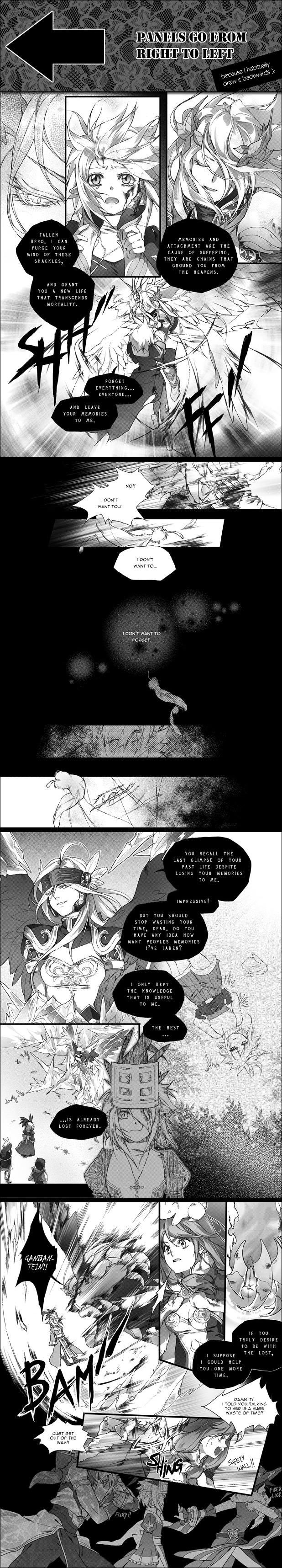
The shaded version of my test-run on drawing on lettersize pages! The story/characters featured are from the game Ragnarok Online. As test pages, their purpose is for me to see if I'm comfortable with drawing on a bigger piece of paper. This scene is just a random segment of a personal RO story and had no planning whatsoever. It is not the starting pages of a series (hence the awkward pick-up) nor will it be continued after this.
The tones I used on this page are either from the Comicworks program (I save the tones and apply them using photoshop instead) or from screentones. Major thanks to the latter link for sharing the tones with all of us!
And thanks to finni for explaining how to create brush-stroke effects for sound effects! I tried it out even though I didn't do it well ): much better than killing my pencil by drawing botches of black on paper
Below are stuff you probably don't care about!
%#$^#%&$^#$%(*!*@$@(*%*$!)*#@)$*!)*#$#%(@
I have an original manga project, Blackbird [link] whose first volume has just been completed (sans like 50 pages that need to be toned still.........) and I am about to start on the second volume.
As you may or may not know, for the past 4-5 years of drawing manga pages for Blackbird, I've always drawn on very small dimensions. I would fold a letter-size paper in half, and draw one page on each half. I was told that drawing big is always better, but since I've been accustomed to drawing small for so long, I wasn't sure if I can handle it. So I decided to do a few test pages before starting volume 2. I was originally going to make the segment Blackbird-related, but decided to draw RO instead when I realized I don't really want to spoil the story.
My conclusion of the test is that while I am comfortable with drawing 1 page per letter, I take twice as long to do a page because I get lost in the same amount of small details ]: I also end up making the page a lot more chaotic because most space=more tone spam to me apparently! The bigger page allows for the smaller figures to be drawn properly though, and it feels better than drawing 2 pages on 1 page in general, so I think I'm going to go ahead with the change and just... try to chill out with the details and tones LOL;;
The only other issue is with shading. As you can see this page is titled "shaded" and most people are cel-shaded in the manner of simple b/w CGs. Normal manga pages don't have nearly this much shading (and not in the same style either, since I do this digitally while real mangas use tones) so it makes my pages look odd. However I do this just because I can and it doesn't take much time, and the depth it adds to certain panels helps out a lot, especially in confusing fight scenes (speaking from experience of Blackbird.) I am still not sure whether I should shade or not shade but so far I'm leaning towards shading
Lastly this RO story is based on the fact that the Valkyrie in Valhalla tells you that your memories will be taken away when you transcend. The Valkyrie in my story however does this in order to obtain knowledge. She is also randgris, and randgris is the result of her growing power, that's why her appearance changed after the flashback. For all of you who don't play RO, if you want to know, the first winged woman is Valkyrie, a job change npc, the black-winged woman is a boss monster, the ice is a skill called ice wall, ganbantein is a skill that cancels all land-based skills in an area, and the rest of the characters are all player classes.