This post was deleted for the following reason:
Poorly drawn / below avarage quality ()
Resized to 60% of original (view original)
Artist's commentary
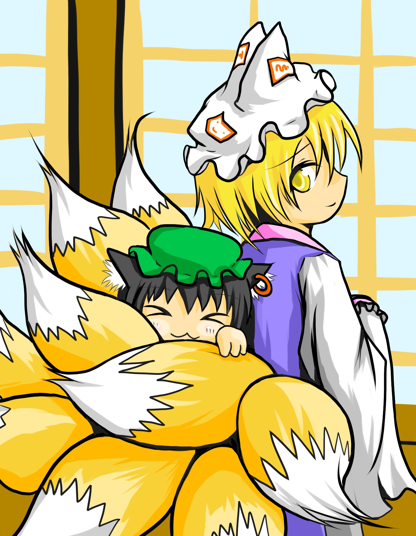
もふもふ
藍しゃまの尻尾は干したてのお布団の匂いがします。わふー
This post was deleted for the following reason:
Poorly drawn / below avarage quality ()
藍しゃまの尻尾は干したてのお布団の匂いがします。わふー