
Artist's commentary
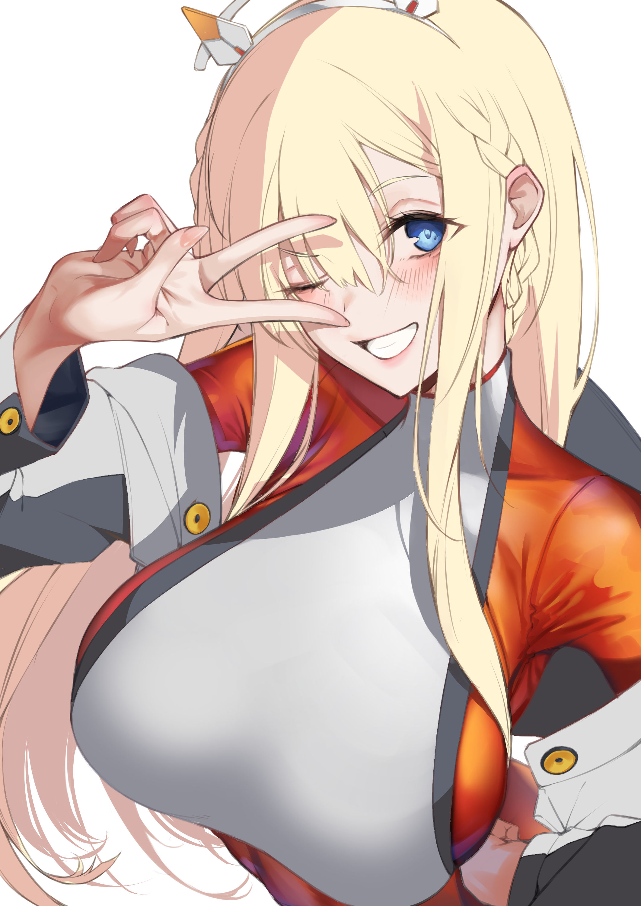
[全体公開]トーブメイキングと反省会
久々の作業工程です。
今回は勉強した事の実践に焦点を当てて描いてます。
(It has been a long time since I have worked on this process.
This time I draw focusing on the practice of what I have studied.)
[translate by deepl]
・光沢系の素材
・柔らかい布素材
この2点を意識して作業しました。
(1,Glossy material
2,Soft cloth material
I worked with these two points in mind.)
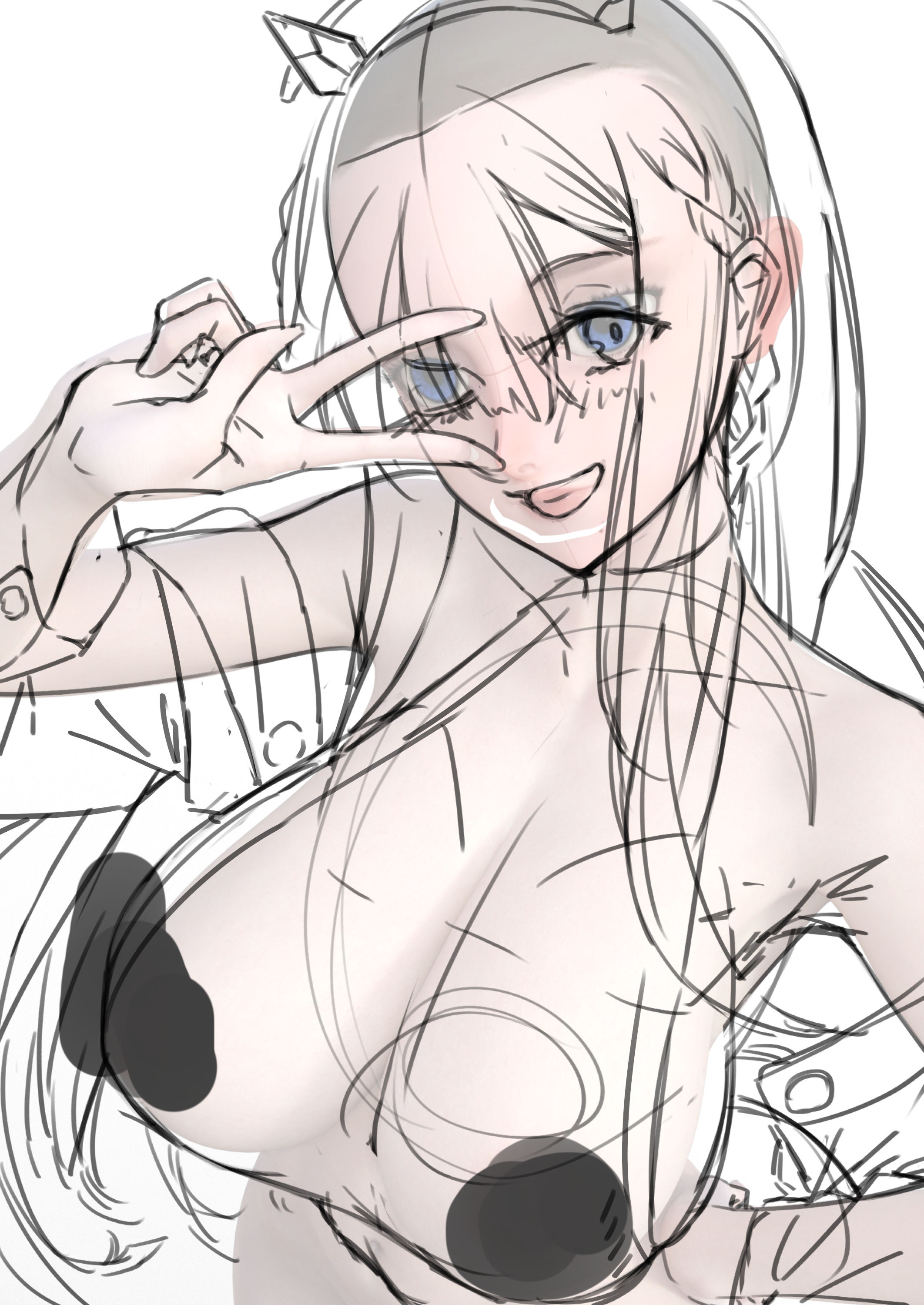
1,ラフ(rougth)
https://downloads.fanbox.cc/images/post/7051611/RlkH1dyCHi4BIgxqb4MEUMTc.jpeg
基本部分はいつも通り。
3Dでポーズを作って下書きにします。
腰から下はそのままだとメリハリなくてダサかったのでアタリを取り直して描きました。
体の反りや脱力をイメージしてポージングをしましょう。
手はクリスタでもDAZでもプリセットのポーズを少し弄ってつかいます。
基本的にそのまま使うとシーンと合わずぎこちないポーズになります。
(The basics are the same as always.
Poses are created and drafted in 3D.
The body from the waist down is not crisp and lame as it is, so I added a bite and redrew the body.
Poses were created with the curvature of the body and a sense of weakness in mind.
For the hands, use the preset poses from Clip Studio or DAZ, and modify them slightly.
Basically, if you use the poses as they are, the poses will look awkward and out of place in the scene.)
https://downloads.fanbox.cc/images/post/7051611/IXsdQZN9oQbuSiKMMvftKS7z.jpeg
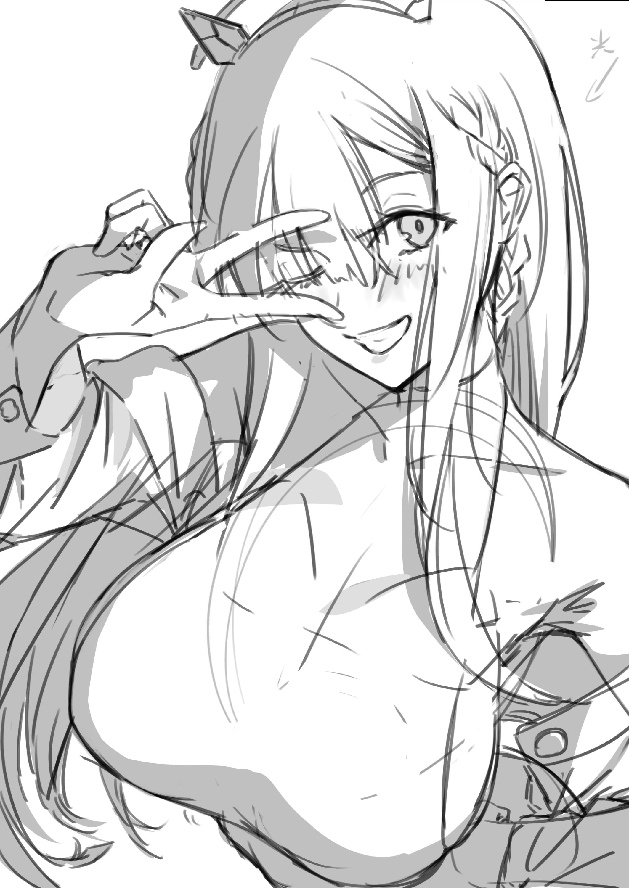
ある程度クリンナップして塗るときに分かりやすいように影付けしてラフは終わり。
普段描かないタイプのキャラなので顔の造形すげー悩む。
(I finished the rough sketch by adding shadows to make it easier to see when I paint.
I had a lot of trouble figuring out the face of this character, since I don't usually draw this type of character.)
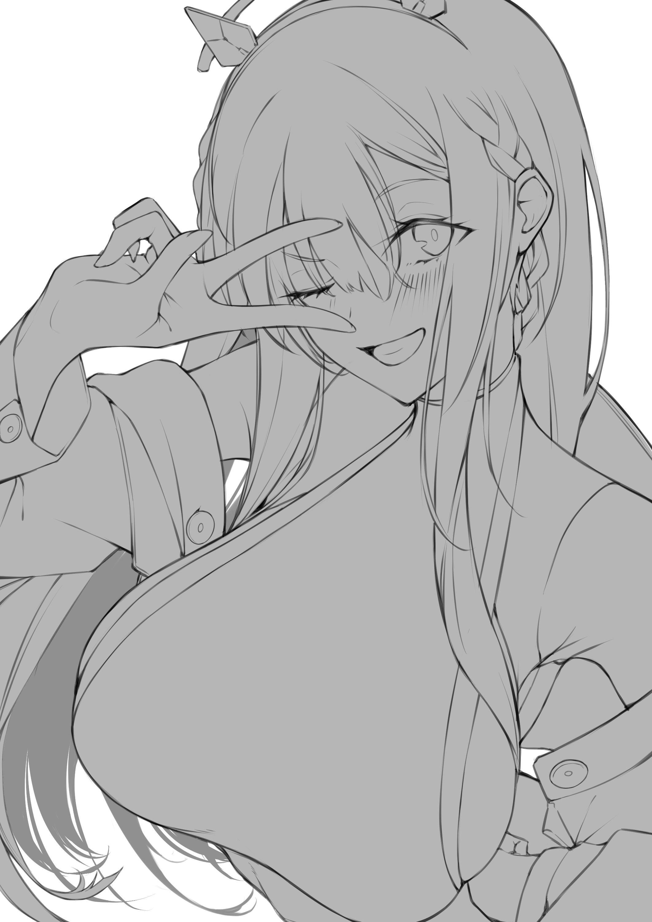
2,線画(line drawing)
https://downloads.fanbox.cc/images/post/7051611/f5hl14O5zMGr2no39lqiGZoJ.jpeg
最近漫画を描いていて輪郭線はもっと太く仕上げたほうが良いと感じたので意識して太めにしました。
パーツを分ける境界ごとに輪郭を太くするイメージなのですが今回は案外細い所も残ってしまいました。改善の余地あり。
(Recently, when I was drawing manga, I felt that the outlines should be thicker, so I made a conscious effort to make them thicker.
I thought it would be better to make the outlines thicker at each boundary that divides the parts, but this time I left some parts thinner than I expected. There is room for improvement.)
3,ざっくり下塗り(base color&shade)
https://downloads.fanbox.cc/images/post/7051611/p27e1W5vbMHdB9syvch8GX83.jpeg
普段は影色を直で塗る事が多いのですが、今回は乗算レイヤーをメインで使います。
(I usually apply shadow colors directly, but this time I will mainly use a multiply layer.)
4,肌塗り(skin)
今回のポイント(肌以外も同じ)
まずは筆圧を使わず固めに塗る。
(Key points for this time (same for all except skin)
First, apply hard without using brush pressure.)
https://downloads.fanbox.cc/images/post/7051611/tCWMuu4zs3ac1zEcyquX4Zw3.jpeg
その後にならす筆圧つけて綺麗にならして描き込む。
(After that, apply pressure to the brush and draw a clean, smooth brushstroke.)
https://downloads.fanbox.cc/images/post/7051611/MHm6Tcpw4qk4GK1iF1AItGo6.jpeg
あとはコントラストが弱く感じたのでトーンカーブで調整したり更に描き足し。
(The contrast was also felt to be weak, so the tone curve was used to adjust the contrast and add more drawings.)
https://downloads.fanbox.cc/images/post/7051611/5hvfXDwveox7l1w9aDtU9p3r.jpeg
いい感じ。
(good!)
5,スーツの塗り(bodysuit)
結構詰まったポイントです。
コントラストが強くなる材質なので濃いグラデーションを意識的に乗せつつ、とにかく試行錯誤。
(This was quite a difficult point.
The material has a strong contrast, so we consciously put on a dark gradation, but it was just a matter of trial and error.)
https://downloads.fanbox.cc/images/post/7051611/rKSXXHchPMBn7Ca6DPGH363H.jpeg
感覚に頼りすぎてあまり言語化出来るように描けなかったのが残念な所。
(It is a pity that I could not draw too theoretically because I relied too much on my senses.)
https://downloads.fanbox.cc/images/post/7051611/hhUp1mFftTCBJsLPQ3ur4M3x.jpeg
そんな時でも「資料をよく見て描く!」という鉄則を守れば多少はそれっぽくなります。
(Even in such a case, if you follow the ironclad rule of looking carefully at the material and drawing it, you will be closer to a good result.)
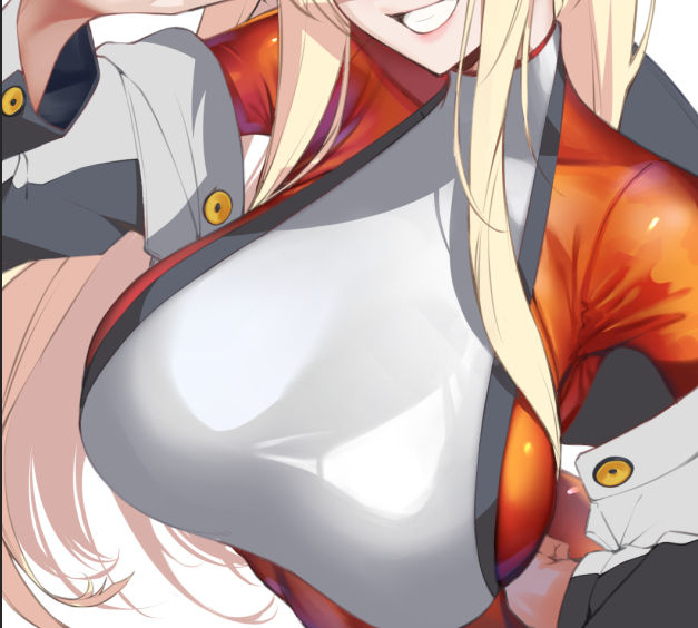
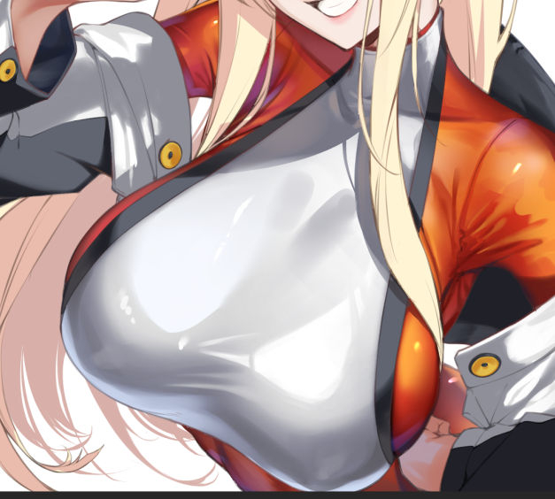
6,胸部分の描き込み(breast)
とりあえず光沢を描きます。
屋外晴天下(かもしれない)くらいの雑想定でスタートしたのでライトの色に迷いが見られます。
良くない例なのでちゃんと環境に合わせて統一しましょう。
(First, paint the gloss.
The color of the light is not consistent with the environment, which is not a good example.
This is not a good example, so let's make sure the colors are consistent with the environment.)
https://downloads.fanbox.cc/images/post/7051611/1xXcoBxNnwjnXIwB9qmFedby.jpeg
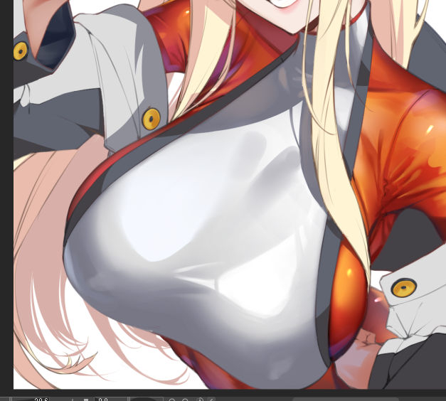
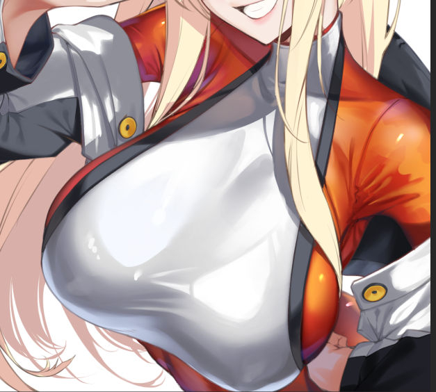
トーンカーブでコントラストを修正しつつ陰影を描き込みます。
(Add shading while correcting contrast with tone curves.)
https://downloads.fanbox.cc/images/post/7051611/0Dt6quRcUb0cASZfiXHE73Ax.jpeg
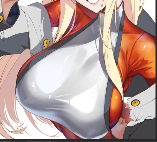
あとは更に描き込みつつ照り返しを入れて一旦完成。
(Further drawing and completion.)
https://downloads.fanbox.cc/images/post/7051611/Ta0WscGy98KDQhE9909ER1Qj.jpeg
7,服のシワ(clothes)
白い部分は更に白みをあげて、灰色の部分は更に影を濃くしてコントラスト調整します。
本来はこういう描き方するつもりはなかったのですが白側の下地に使ったグレーがいい感じにフォームシャドウとして機能しそうだったのでそのまま使います。
(The white fabric is further whitened, and the gray areas are further contrast-adjusted by making the shadows darker.
Originally, I did not intend to paint in this way, but the gray used for the base of the white side seemed to work well as a form shadow, so I used it as it is.)
https://downloads.fanbox.cc/images/post/7051611/dsrDZSbiAch1WU9FhgIbMlWa.jpeg
グレーの記事と白い生地のシワを更に描き込んで一旦完成。
(Add more gray articles and white fabric wrinkles.)
https://downloads.fanbox.cc/images/post/7051611/lrKWv2EpS9FJkiWqU4TpjajU.jpeg
いい感じ。
(niceee!)
8,髪(hair)
ざざーっと影色を置きます。
今回は髪はそんなに頑張らないぞという謎の意気込みがあったのでほんとにざざーっと描きました。
(Place a simple shadow color.
I decided to paint my hair as simple as possible this time.)
https://downloads.fanbox.cc/images/post/7051611/JLAFffOZfUM53a5KpAXKlLqb.jpeg
色味とコントラストを調整し描き込み。
(Color and contrast are adjusted and painted in.)
https://downloads.fanbox.cc/images/post/7051611/1S9lroCOuLqRmKWP6SNjsSxx.jpeg
更に最後にもう1段階描き込み。
(draw even more)
https://downloads.fanbox.cc/images/post/7051611/ntBn4DWms9Ps5egBqRWQ05kR.jpeg
周囲のパーツとのトーンも合ったんじゃないでしょうか。
(I think I could have matched the tone with the surrounding parts.)
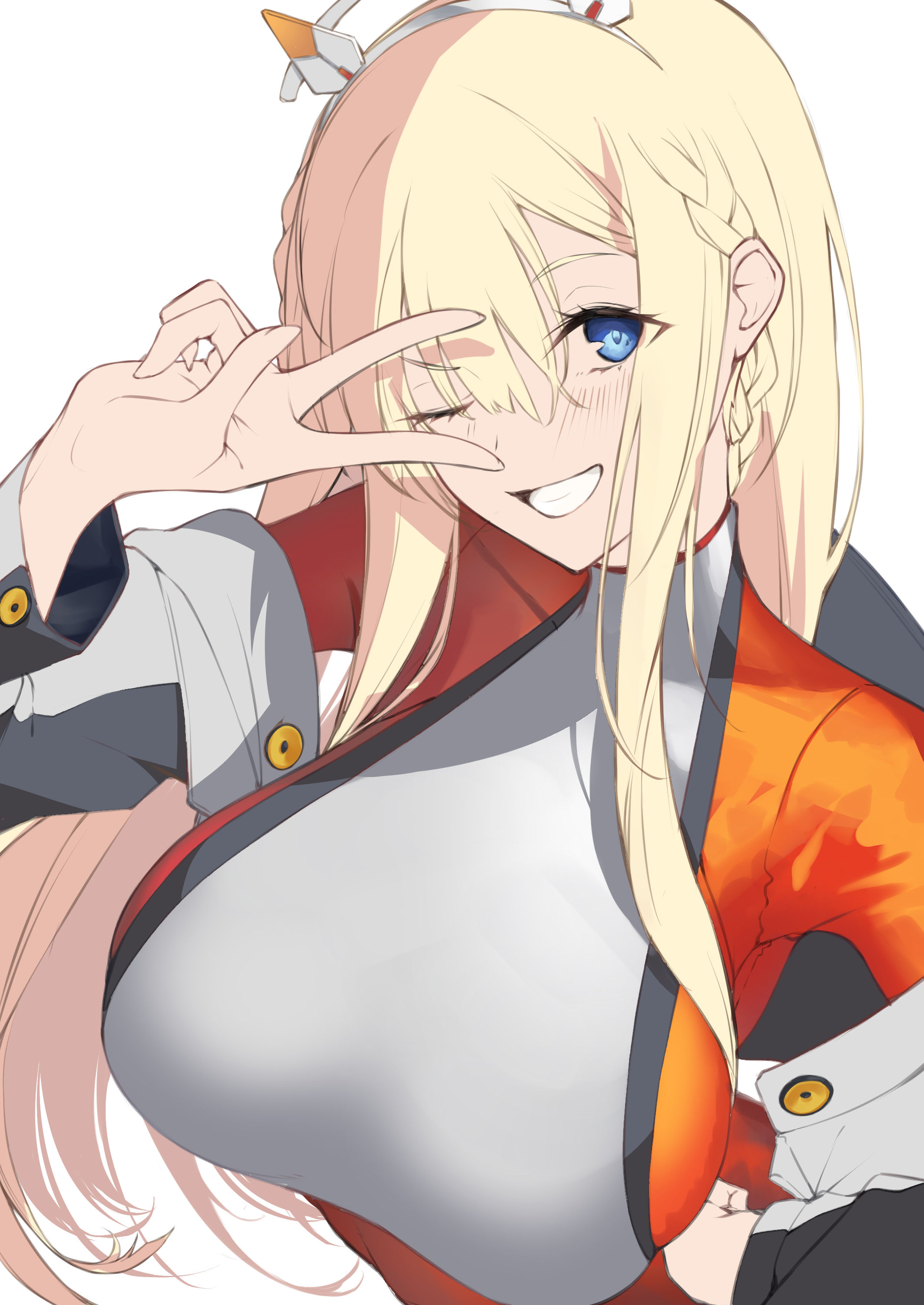
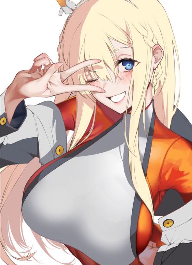
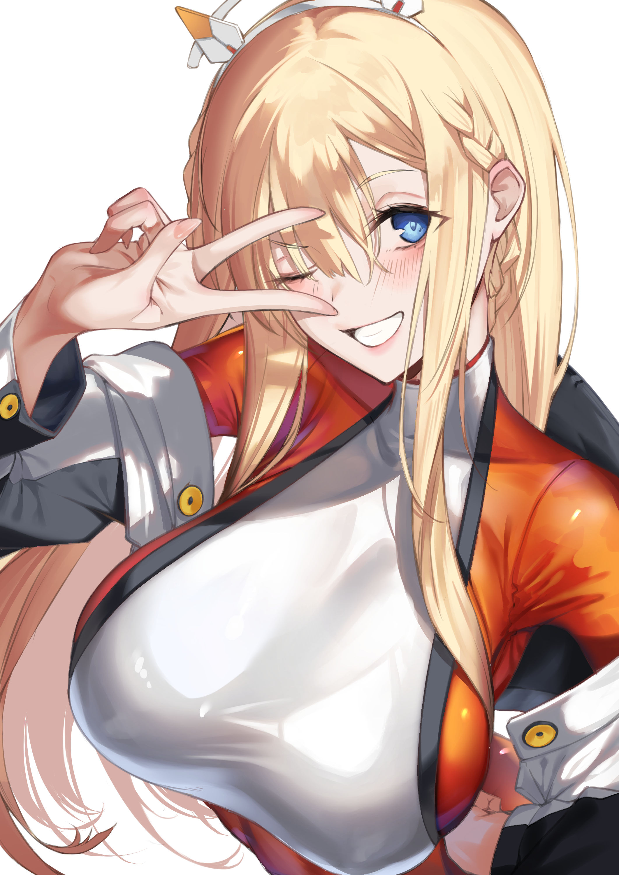
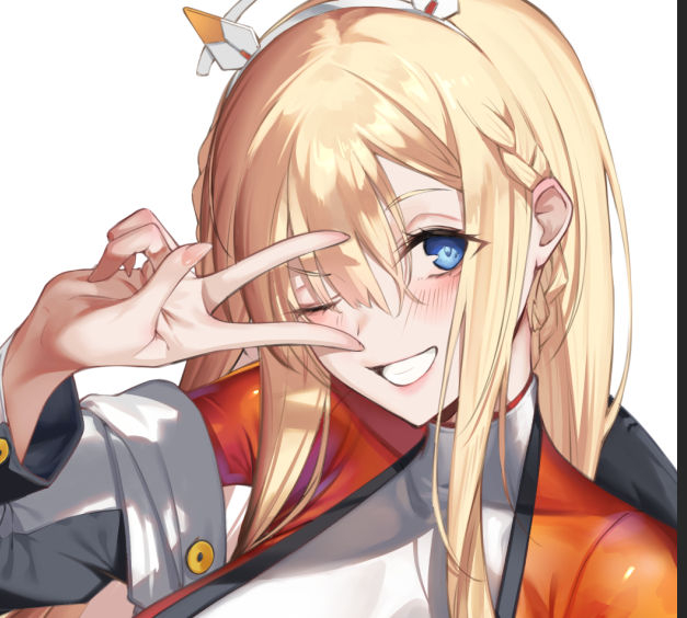
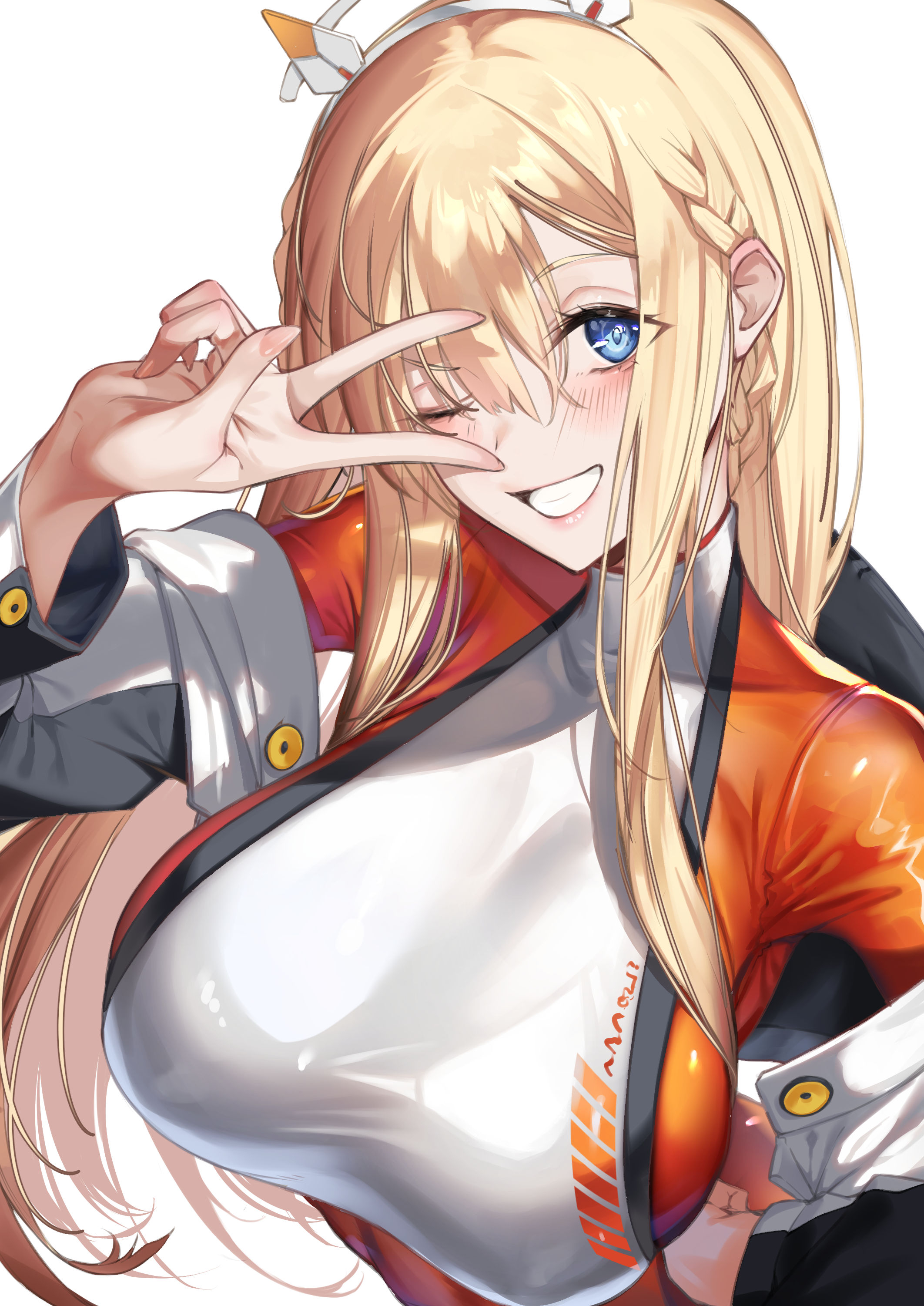
9,仕上げに厚塗りして完成(finishing touches)
https://downloads.fanbox.cc/images/post/7051611/Sp7GjoWrOKg1OuNli3ZgPq2H.jpeg
後れ毛を書いたり足りない所に赤みを足したり……。
あと全体のコントラストを再調整してグラデーションマップで色に統一感を出しました。
(I wrote the back hair and added reddish color where it was missing. ......
I also readjusted the overall contrast and used a gradient map to make the colors more consistent.)
https://downloads.fanbox.cc/images/post/7051611/Ol5cIssKFupaq7nLx2ln4FOL.jpeg
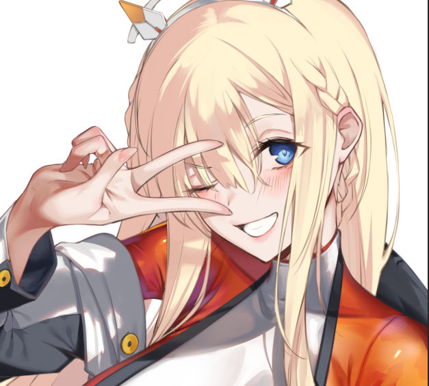
完成!!
(Completed!!)
反省会(reviewing)
今回はライトの色や環境光の設定がおざなりでしたね。
あとはとにかくなんか好きに描きたいという意識が強すぎて演出とか全く考えずにかわいいシーン描いただけになってしまいました。
(This time, the color of the lights and the ambient light settings were not well thought out.
I was too conscious of wanting to draw whatever I wanted to draw, so I just drew cute scenes without thinking about the direction at all.)
あとは新しい塗り方に引っ張られて僕の絵っぽくなくなった所はあるかも?
結果自体は悪くないと感じたので使いこなしてしっかりと自分の絵にしたい。
(I also felt that the new painting method pulled me in and my painting was less like my own.
The result itself is not bad, so I want to master it and make it my own.)
雑談(small talk)
今年は中々時間が取れず気づいたら12月です。
時の流れがマジで早すぎる……。
(I couldn't find much time this year and before I know it, it's December.
Time really flies by too fast......)
今月は特に色々あってバタバタしました。まだしてます。
今年はキツイかもですが、落ち着いたらまた自分の絵とか上げていきたいですね。
えっちな絵も沢山描きたいです。
今はパイズリが描きたい。あと足コキ。
(This month has been a particularly busy one for me. I am still working on it.
It may be tough this year, but once things settle down, I'd like to start uploading my drawings and paintings again.
I want to draw a lot of erotic pictures.
Right now, I want to draw paizuri. And also foot-jobs.)
そういえば商業誌で2度目の漫画掲載します。
エンジェル倶楽部1月号に掲載されると思いますので、
もしご興味ありましたら読んでやって下さい。
漫画も勉強してもっと上手くなって、前の同人誌のリメイクとか新しい本とか描きたい。
やりたいことが多すぎるねぇ……。
頑張ります。
(Speaking of which, I will be publishing my second comic in a commercial magazine.
It will appear in the January issue of Angel Club.
There is a digital version on Fanza, but I think it is only in Japanese. Sorry.
I would like to study manga and get better at it, and draw remakes of my previous doujinshi and new books.
I want to study manga and get better at it, and draw remakes of my previous doujinshi and new books.
There are too many things I want to do......
I will do my best.)
またファンボも頑張って更新するので次回も見てやって下さい。
それでは、またお会いしましょう。サヨナラ。
(I will update the fan box again, so please check back next time.
See you again. Sayonara.)