Danbooru changelog discussion thread

Posted under Bugs & Features

MaskedAvenger said:

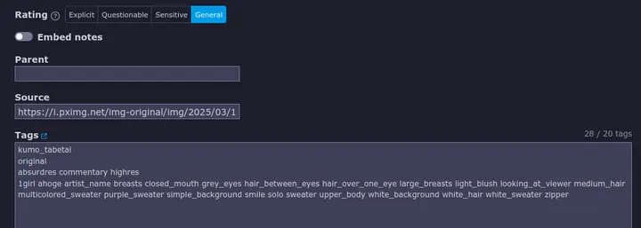
Also the text box for the tags has smaller text now. Any reason for this? Any CSS to make it larger again? I didn't alter my custom CSS before the change BTW.

Quoting my earlier post so I could show what I meant above:

What changed in the code? And I do see this on desktop and mobile.

nonamethanks said:

That does not look normal. Try completely removing your custom CSS and readding lines one by one, because to me it looks like this:

Well it does appear on your end, the text on the tags field is smaller too compared to the source field.

Damian0358 said:

If we're going to talk about text size changes, this latest update has turned the text size in the forum's message box and when editing wikis larger, and that's throwing me off.

It feels like I'm accidentally browsing the site at 110% zoom...

MaskedAvenger said:

Also the text box for the tags has smaller text now. Any reason for this? Any CSS to make it larger again? I didn't alter my custom CSS before the change BTW.

Before there was an inconsistency where the tags were large when using the shift+E tag edit dialog box and small when not using it. Now it's the same size for both.

Damian0358 said:

If we're going to talk about text size changes, this latest update has turned the text size in the forum's message box and when editing wikis larger, and that's throwing me off.

It was changed so that when previewing a forum post or wiki page, the text in the preview is the same size as in the actual post. Before the text in the text box was smaller than in the actual post, which meant previews didn't look the same as what the actual post was going to look like.

evazion said:

Before there was an inconsistency where the tags were large when using the shift+E tag edit dialog box and small when not using it. Now it's the same size for both.

It was changed so that when previewing a forum post or wiki page, the text in the preview is the same size as in the actual post. Before the text in the text box was smaller than in the actual post, which meant previews didn't look the same as what the actual post was going to look like.

What you said never actually happened to me maybe due to my custom CSS, so I was surprised that the text for tags became smaller after the update. Due to this, I have several minutes ago put a separate code for the tag text box to show the text on my desired size.

having a large blacklist makes thumbnails slow to appear. for context, i only have 150 tags blacklisted.

it only takes about ~0.52 seconds, but thats still a noticeable amount of time if youre trying to quickly go through pages. i get the same result on pages with blacklisted tags enabled, blacklisted tags disabled, and pages with no blacklisted posts at all.
expanding your blacklist to a larger amount (755) causes all thumbnails to load at a borderline unusuable ~1.79 seconds.

sabisabi said:

having a large blacklist makes thumbnails slow to appear. for context, i only have 150 tags blacklisted.

it only takes about ~0.52 seconds, but thats still a noticeable amount of time if youre trying to quickly go through pages. i get the same result on pages with blacklisted tags enabled, blacklisted tags disabled, and pages with no blacklisted posts at all.
expanding your blacklist to a larger amount (755) causes all thumbnails to load at a borderline unusuable ~1.79 seconds.

Every blacklist rule is applied to every single post individually. So the more rules you have, the slower it'll take to apply all of the rules.

I did a test where I used 500 random words on a separate line each, which took more than 5 seconds to fully process. I then put all of those same words on the same line, prepending each word with a "~" (functionally equivalent to all on a separate line), which only took around 0.4 seconds to fully process (there's some overhead processing which is why it's not much faster).

Therefore, use less rules if you want it to go faster, combining the tags of different categories for what you want to achieve. For instance, on one of my lines is all of the tags that I never want to see. Other categories I use included male-focused posts with any kind of NSFW, explicit posts and explicit tags, sensitive posts and sensitive tags, etc.

sabisabi said:

having a large blacklist makes thumbnails slow to appear. for context, i only have 150 tags blacklisted.

it only takes about ~0.52 seconds, but thats still a noticeable amount of time if youre trying to quickly go through pages. i get the same result on pages with blacklisted tags enabled, blacklisted tags disabled, and pages with no blacklisted posts at all.
expanding your blacklist to a larger amount (755) causes all thumbnails to load at a borderline unusuable ~1.79 seconds.

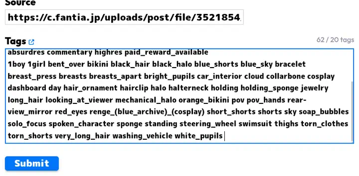
And with even more blacklisted tags...it is unusable ~5 seconds

Why does it take more clicks to select a disapproval reason on the post page now? It makes sense in the modqueue because the space is condensed there but there's plenty of space to fit disapproval reasons on the post page without needing to collapse them into reject.

I'll also voice my annoyance at the new change: it helps nobody to tuck away the disapproval reasons, if this was done to make it harder to accidentally misclick them then that could have been achieved by giving them more space instead of reducing the QoL of approvers.

In general, I'm not opposed to change. But I think this new style for approving posts on the post page could have used some more polishing. There's little padding between the buttons, they are small and mistake prone (not that the old way wasn't tho) and issues others have mentioned etc..

I have an issue with the Confirm Password page, it simply sends me back upon entering it correctly. The account history page shows I'm reauthenticating successfully but I can't escape the endless loop. I'm trying my luck with enabling 2FA, maybe I should take this as a sign.

1 46 47 48 49 50 51